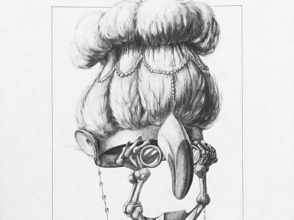
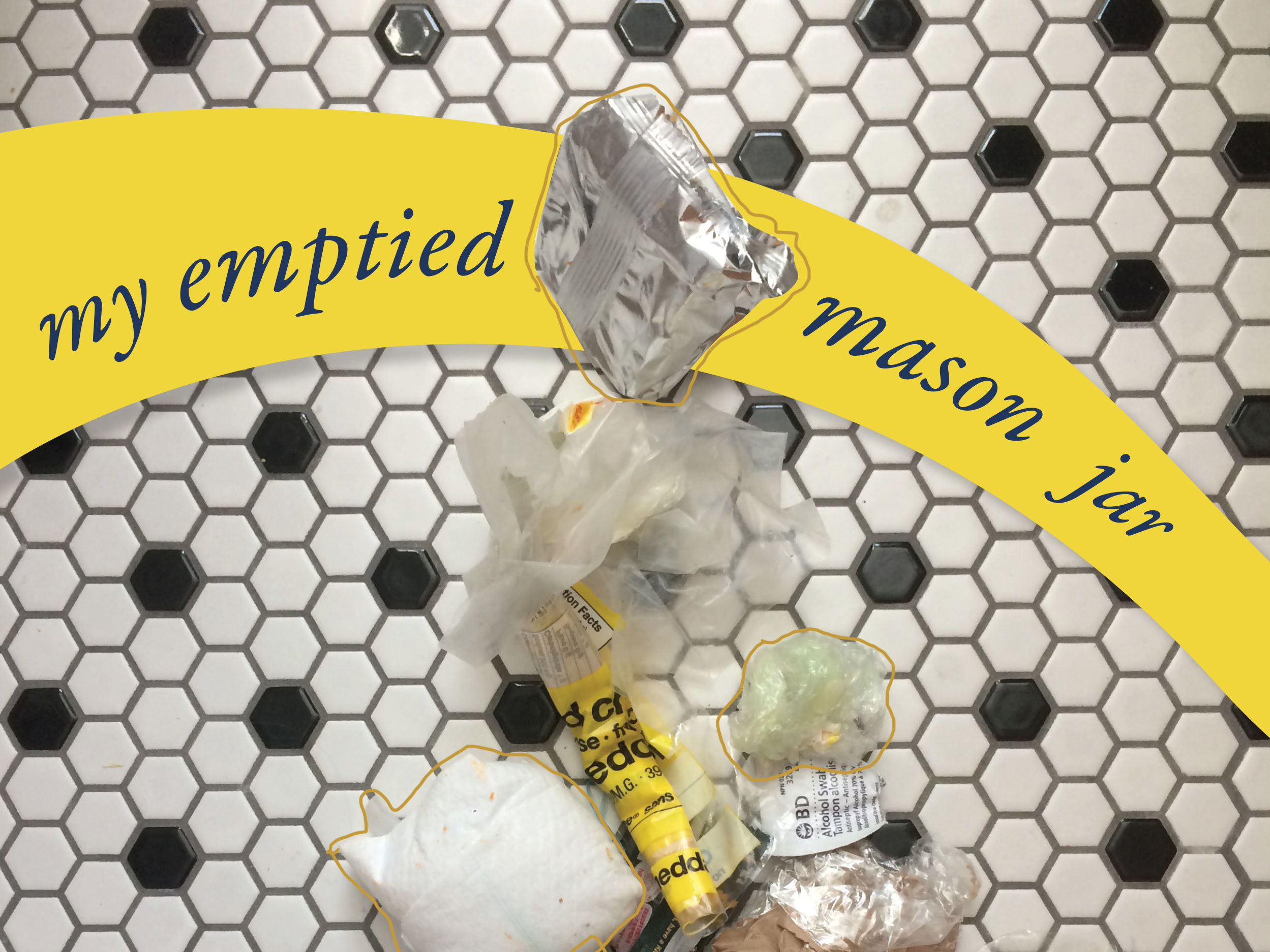
Circus Baba was a poster designed to capture the contrast and drama of a circus spectacle that defies “the boundaries of reality and miracles” and evokes the sense of “magic and mystery”. I printed out “circus BABA” in a grotesk font, manipulated the printouts, and then photographed the manipulations. I manipulated and masked the photographed letter forms to have an “analog” texture and effect. I continued to manipulate the bold/condensed and light font options, and vary the tracking and leading to exaggerate texture and give a sense of suspense, surprise and mystery.
Spirals. Irregularity. Wonder.
Spirals. Irregularity. Wonder.
10 Typographers Lecture poster was designed in homage to modernist typography. Layering on the grid structure and pushing scale contrast was integral to creating blocking and grouping with varied textures that could be read from different distances.
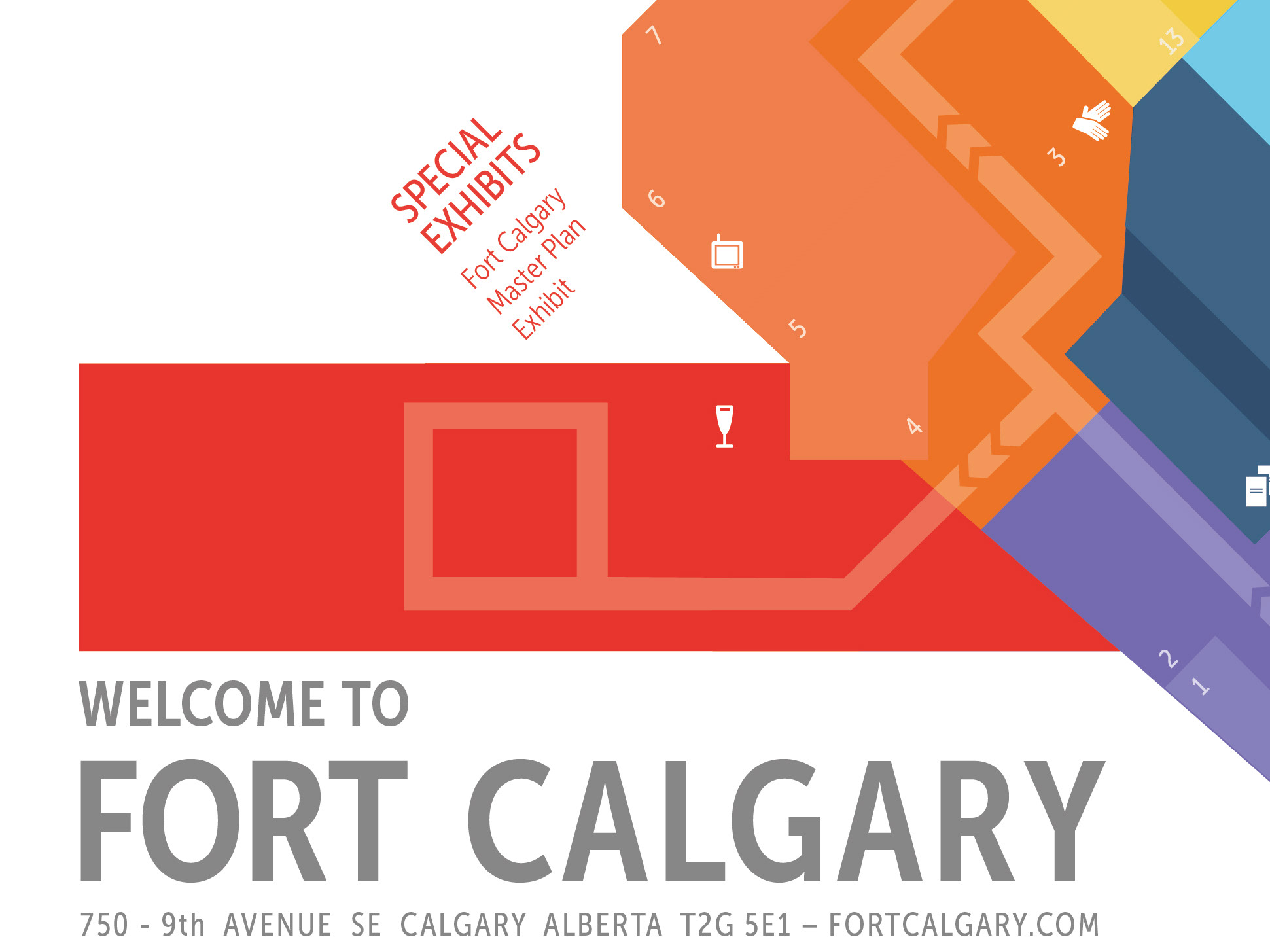
It was designed to be a foldable brochure. I will update with photos of the unfolding to demonstrate.
It was designed to be a foldable brochure. I will update with photos of the unfolding to demonstrate.
In creating a poster to capture the mood of William Caslon’s typefaces, I was heavily influenced by the work of William Morris’ wallpapers, designed about a century after Caslon's work, but both designed in England. I sought to entangle the Caslon letter forms in organic arrangements like the botanical elements in William Morris’ wallpapers. Barring that critical botanical wallpaper concept for the arrangment, the colour and crisp composition is meant to be sharp and contemporary.
