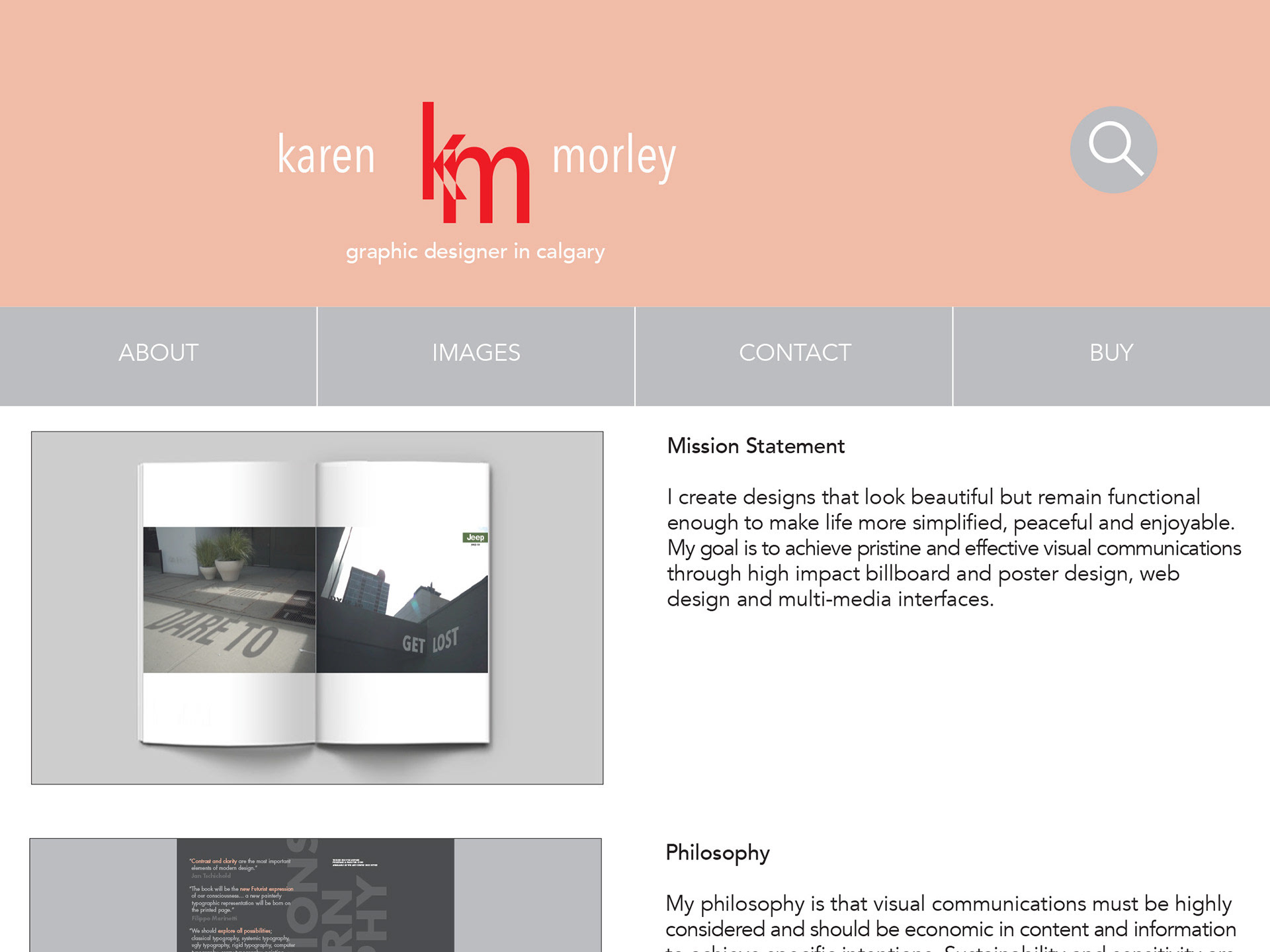
CLIENT
Juggle travel baby bottle warmer. A bottle warmer so simple and portable it gives freedom and relief to new parents and empowers them when feeding their newest and cutest travel companions.
BRAND POSITION
Light, expressive and versatile, for parents who live full and outgoing lifestyles. We know our parents strive for what’s best for baby, but also want to nurture their own vitality and passion. This bottle warmer is a smooth, flexible and uninhibited way to manage essential feeding. No limitations, take your new family wherever your creative spirit beckons.
BRAND STORY
Nothing prepares us for parenting. Feeding is hard. Packing bottles to leave the house is a teetering circus. Highly sensitive and yearning to meet little one's needs, we wonder if we will always be so tied to home.
How can we go for a mountain hike? How can we leave our baby with our partner so we can work, study or see a friend? How can we drive a long road trip?
The load lightens and we find our rhythm. The would-be crises of taking turns with parenting roles drift away. Your small, clever travel bottle warmer soars high with you and your baby.
A wonderful world opens up: spontaneous downtown meet-ups, flights, and weekend getaways. Worries are far away when you and baby are feeding on cloud nine.
PACKAGING CONCEPT
Baby care products need to be marketed with precision and safety as a paramount message while also expressing the friendly, cuddly and versatile benefits of a product that is massively helpful for parents.
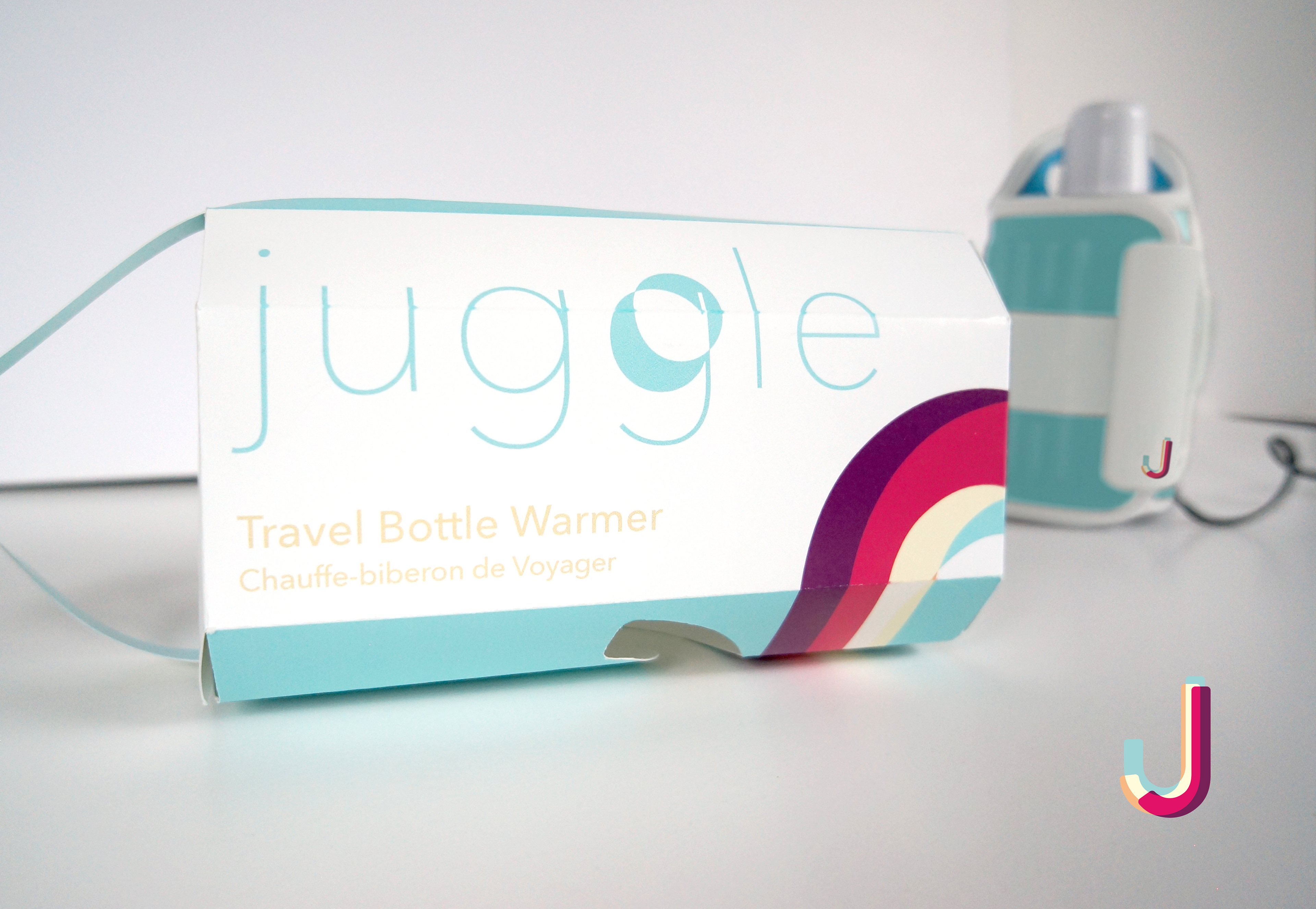
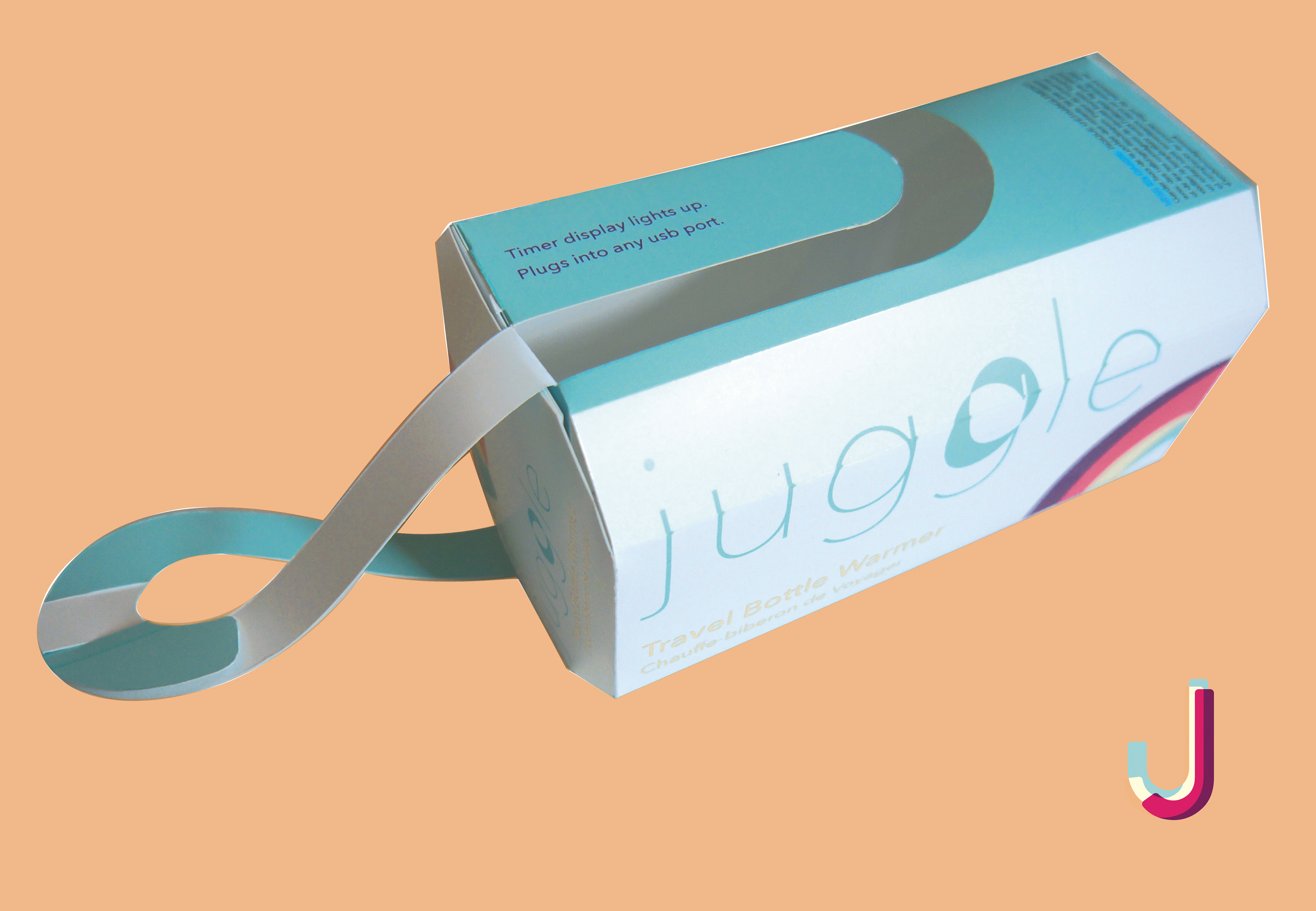
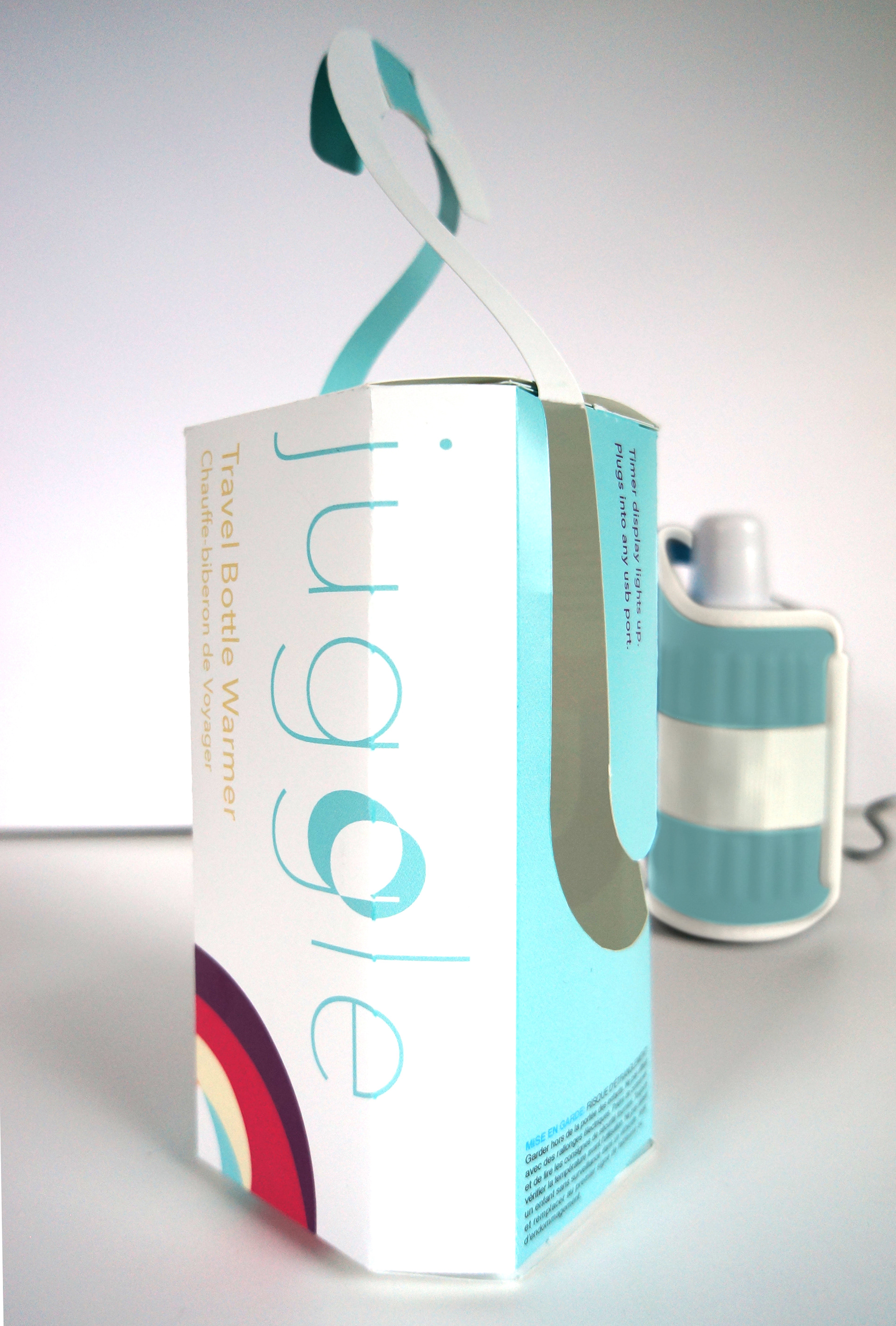
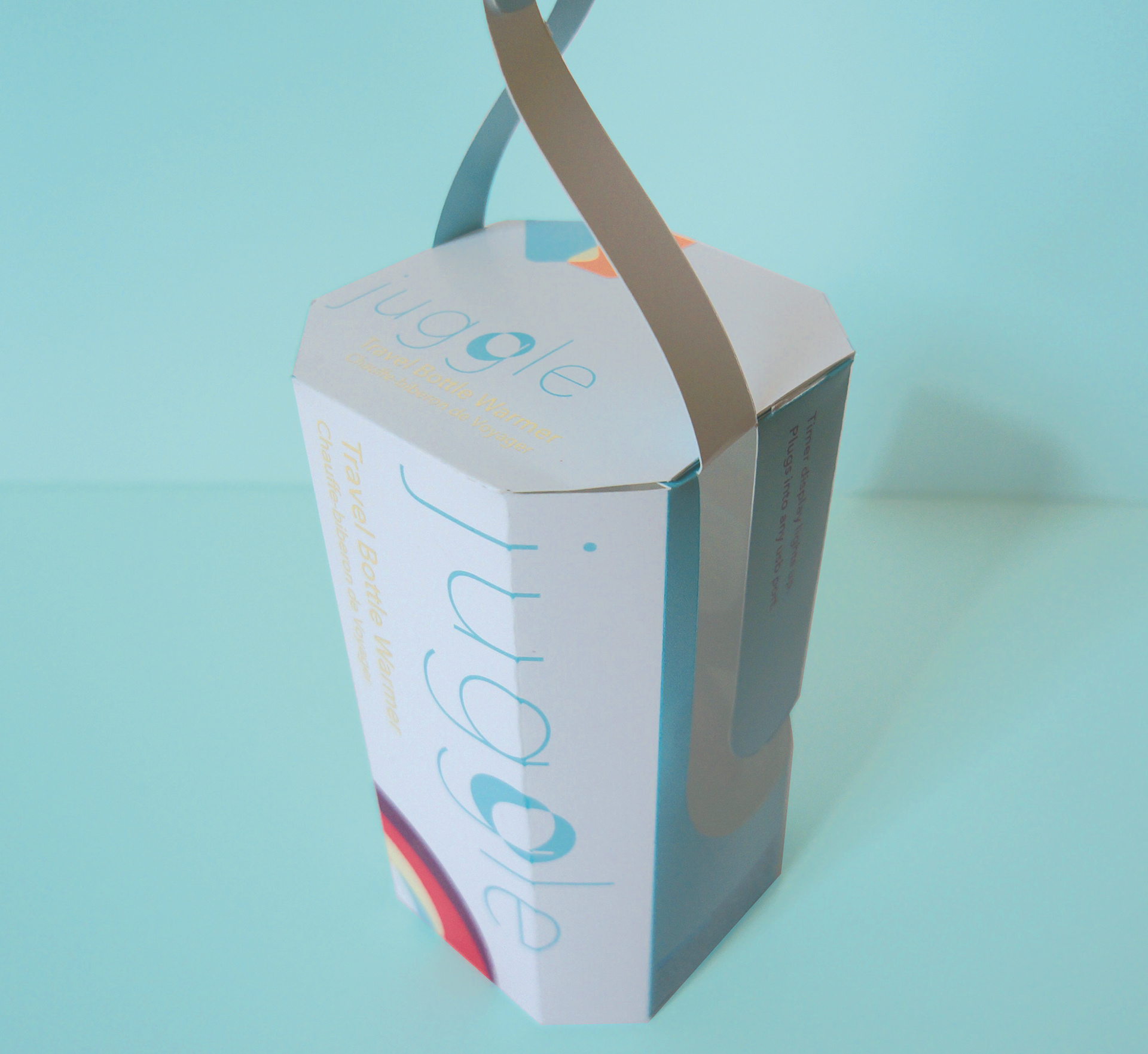
Balanced soft colors and gentle yet precise typography move with ease around the juggle bottle warmer package, mirroring the product’s most important benefit: bottle feeding on the go can move easily with Juggle.
The box is designed so that the “J” of the logo is cut out to give a view of the product, and the “J” then lifts and attaches to its mate from the other side to form a carrier handle. This versatile “J” in the packaging again reinforces an important product benefit: Juggle adapts and moves easily even when parents' hands are chaotically full.
As the Juggle proposal was set to retail in Canada, its packaging was designed to include both English and French text.
BACKSTORY
I started this project when my daughter was only 7 weeks old! My husband and daughter also got to fulfill their wildest dreams of being models in the marketing photo shoots. My daughter had a passport at 6 weeks old and was on an international flight just after her 2 month immunizations — we exemplified feeding on the go and felt quite on-brand.
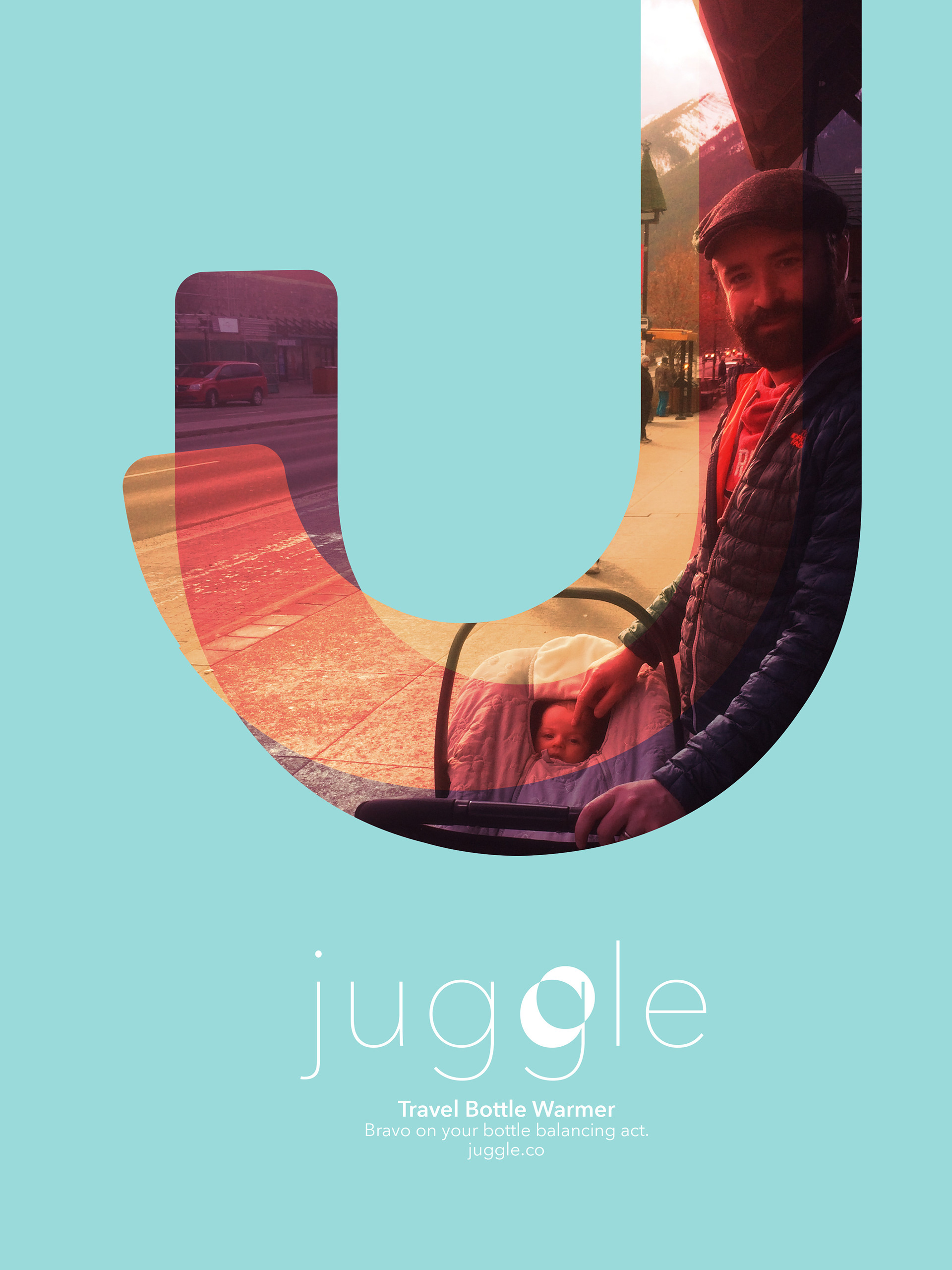
I designed a magazine ad to run as Juggle's print advertising, to appear in parenting publications.
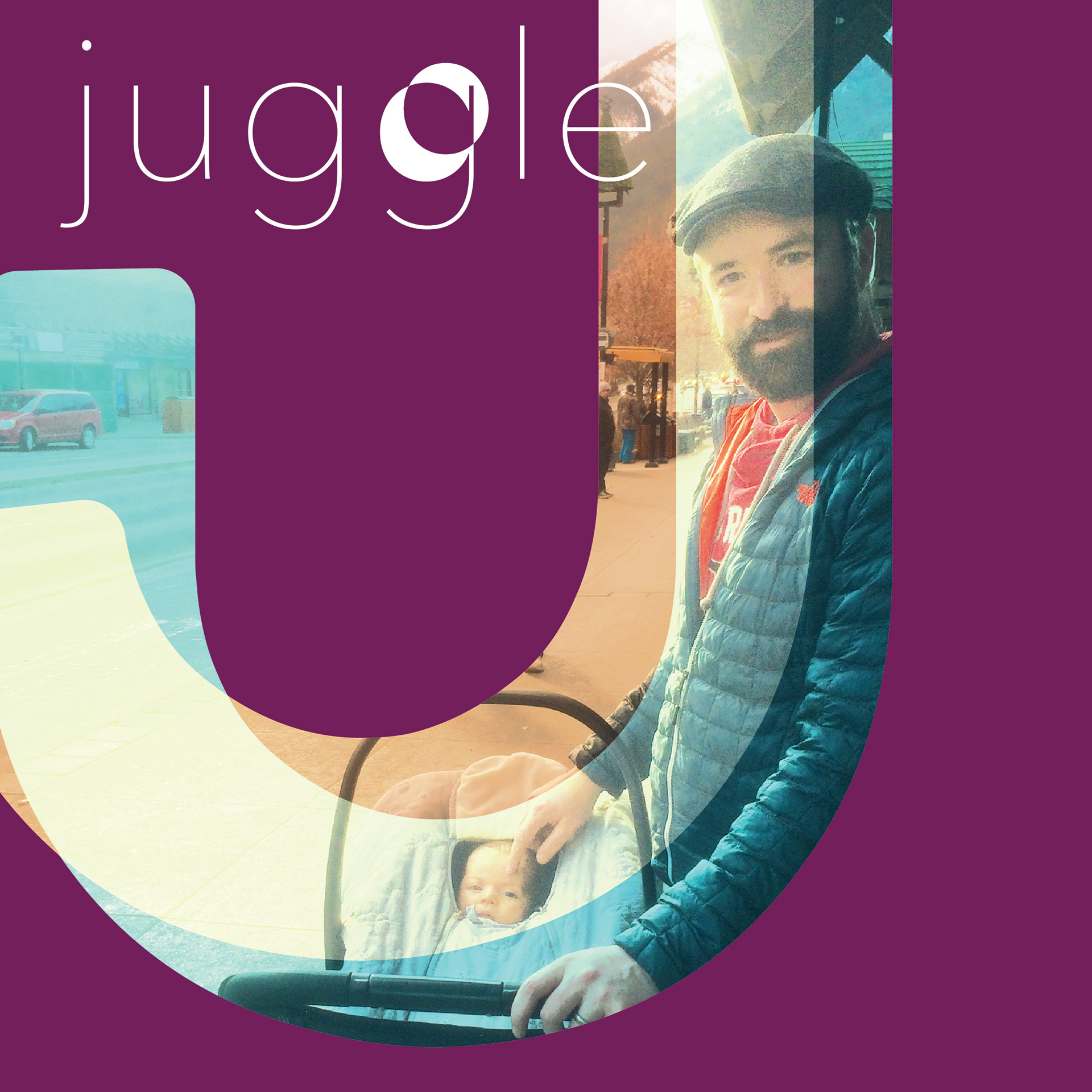
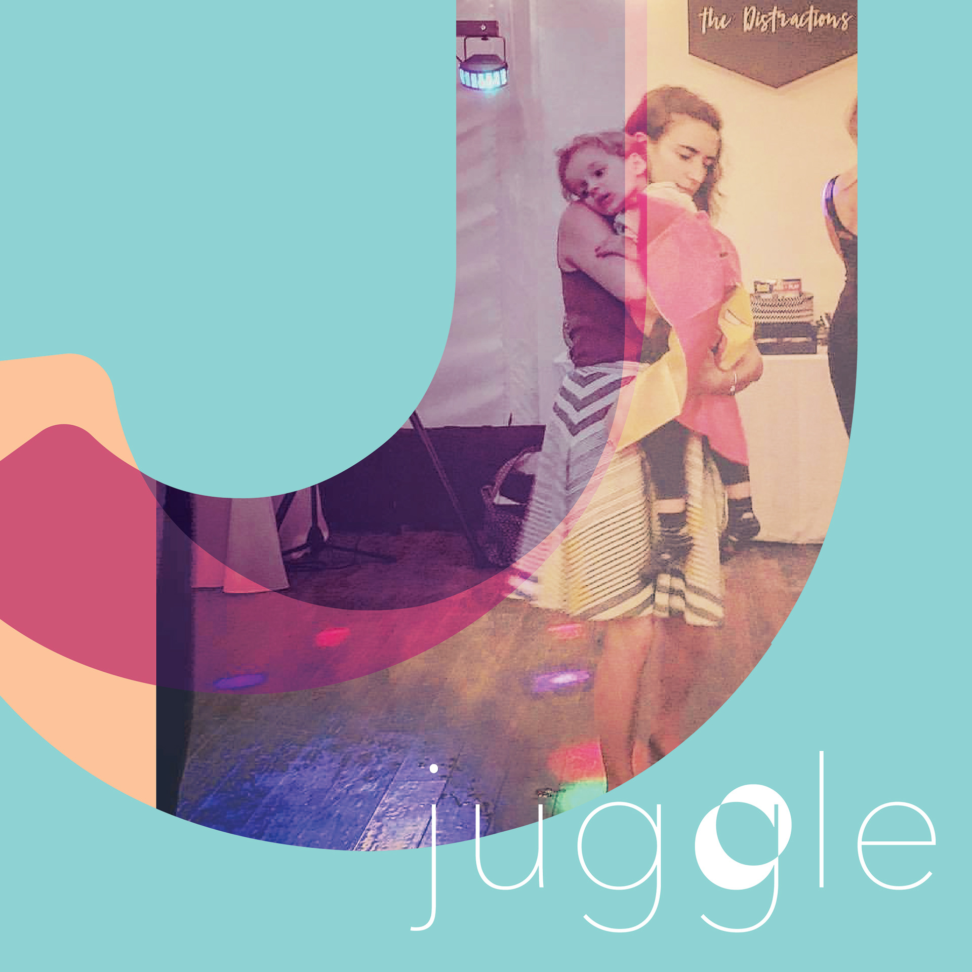
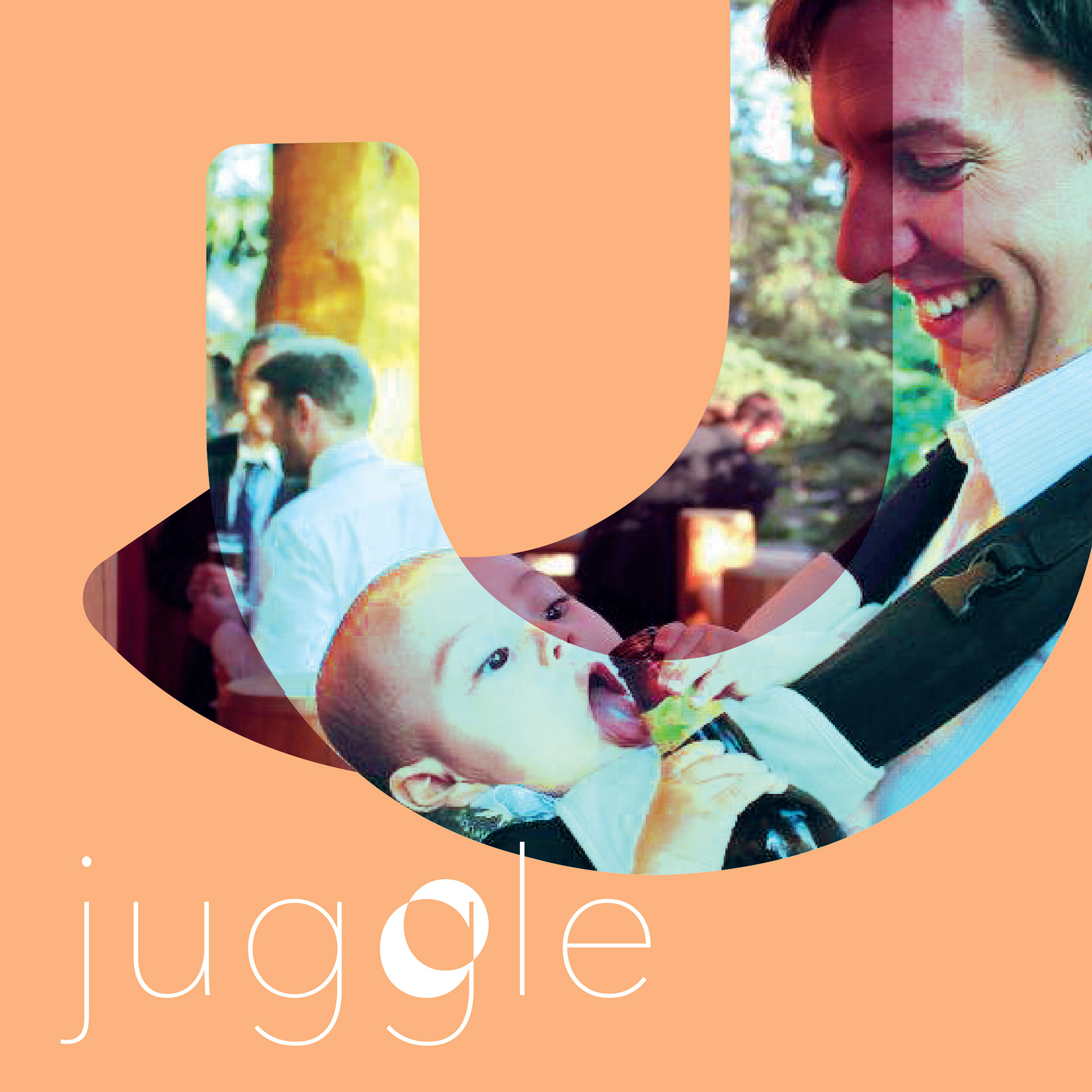
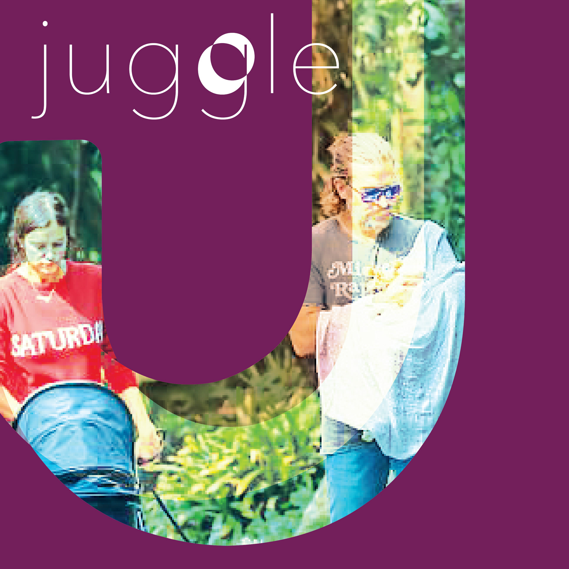
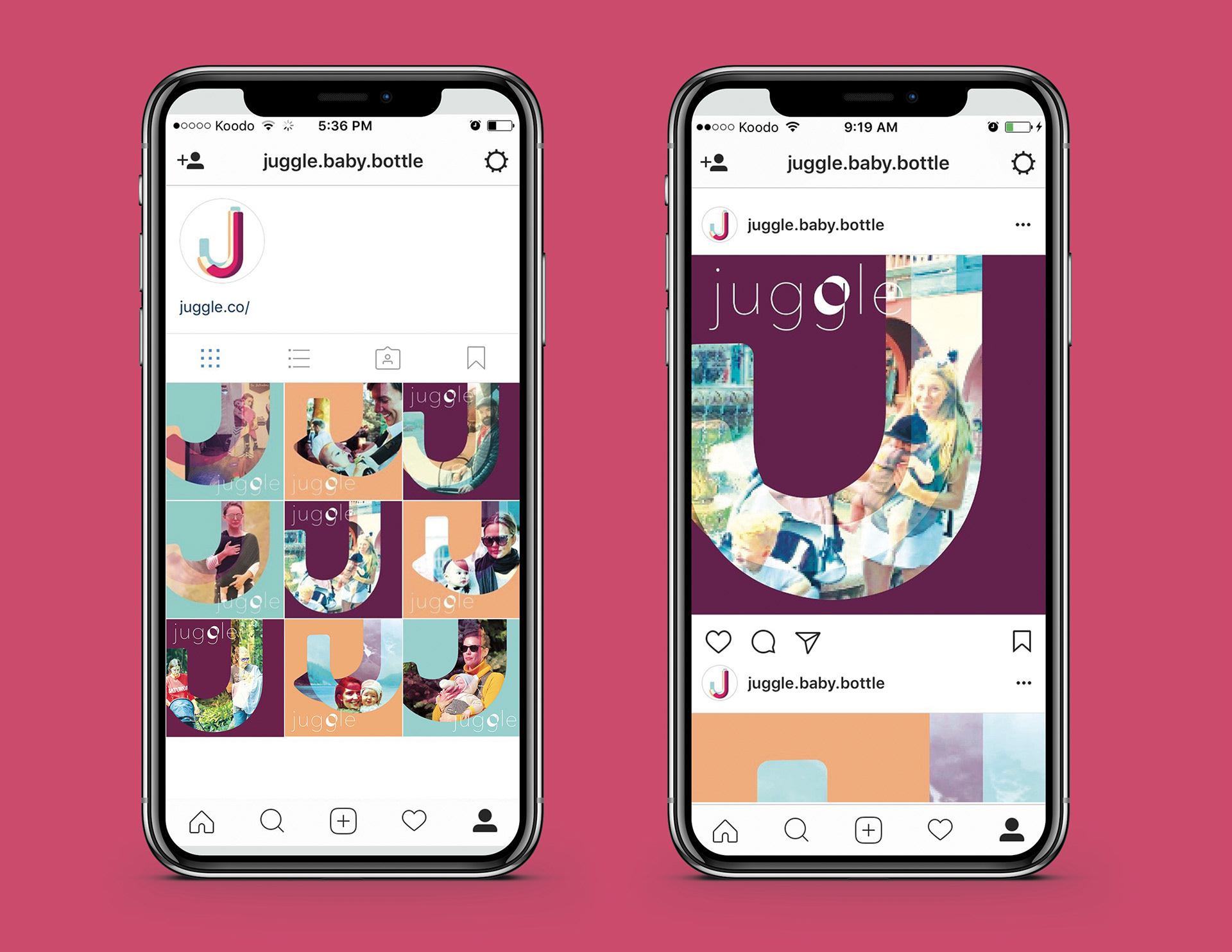
I designed 1080x1080px Instagram ads that used Juggle's “J” as a vignette into the possibilities of feeding on the go.
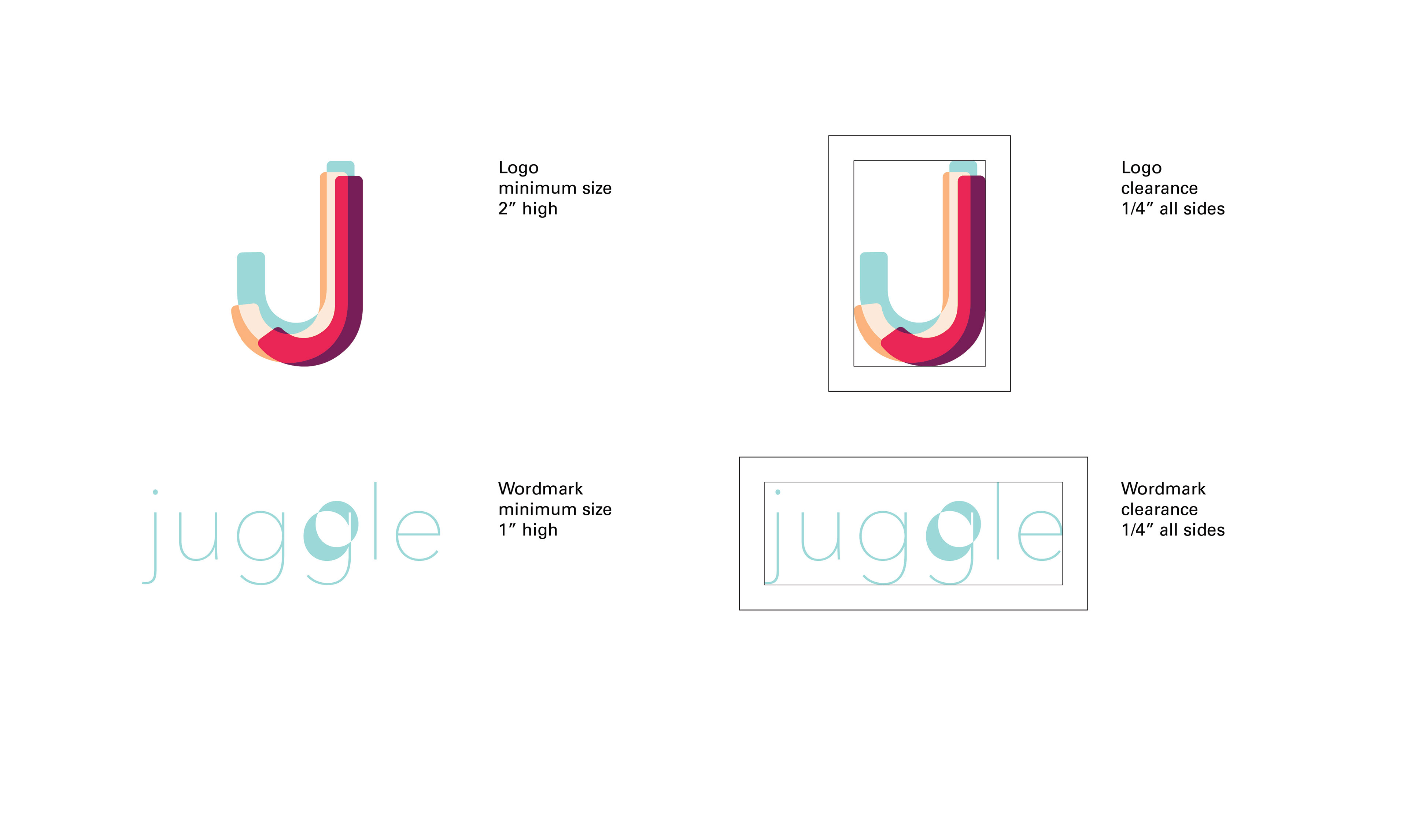
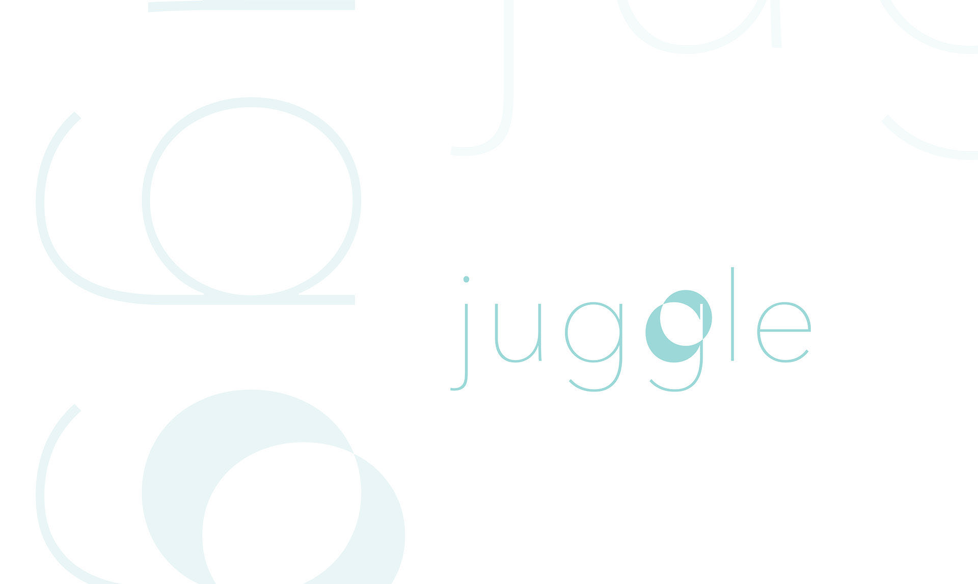
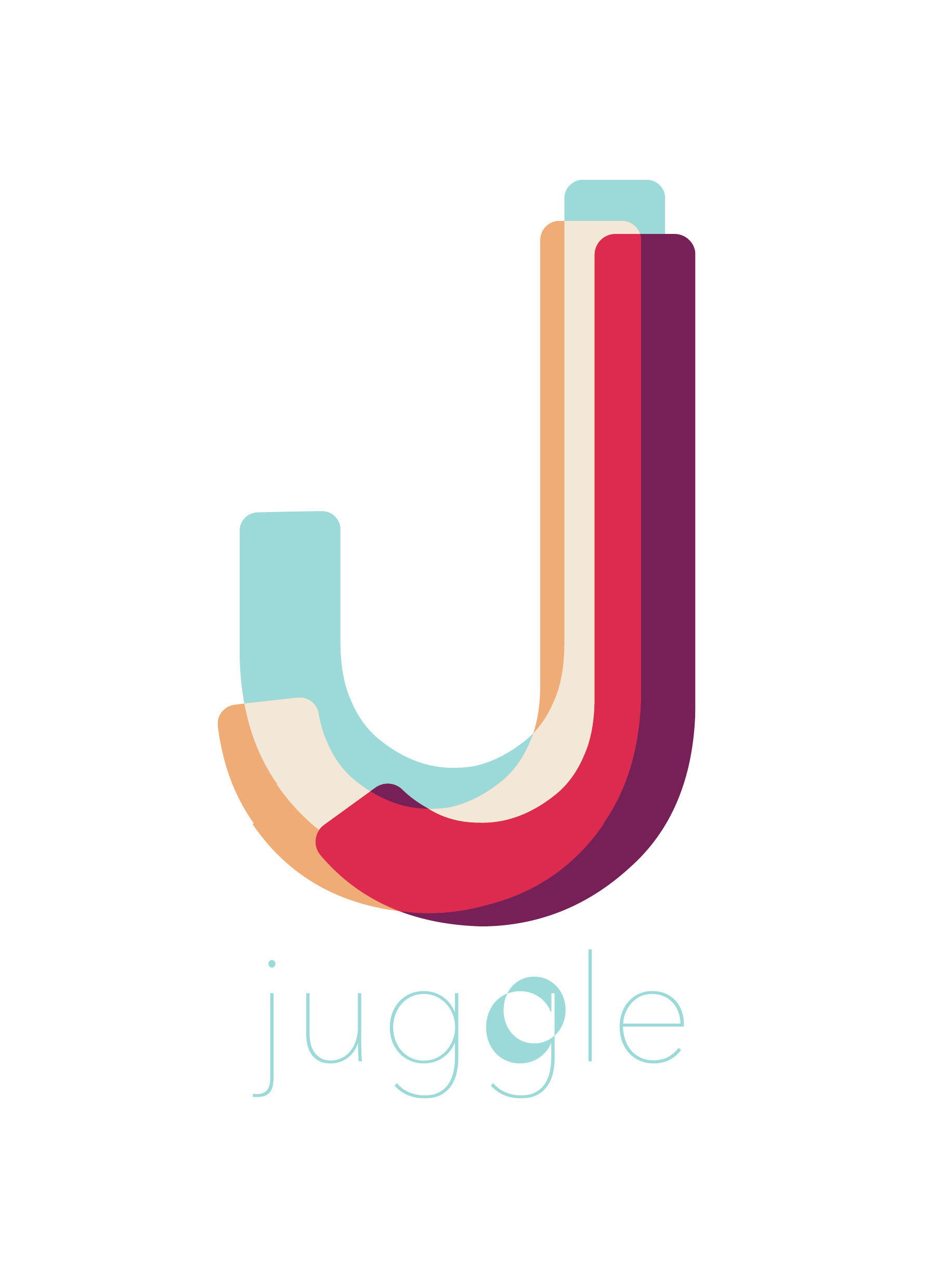
LOGO ICON CONCEPT
The Juggle “J” logo icon is overlapping to reflect the brand values of inclusion. Playful movement and repositioning reflects the brand values of diversity, personalization and adaptability. The icon colors are bright and cheerful, in keeping with the positive impact of the Juggle bottle warmer as a product.
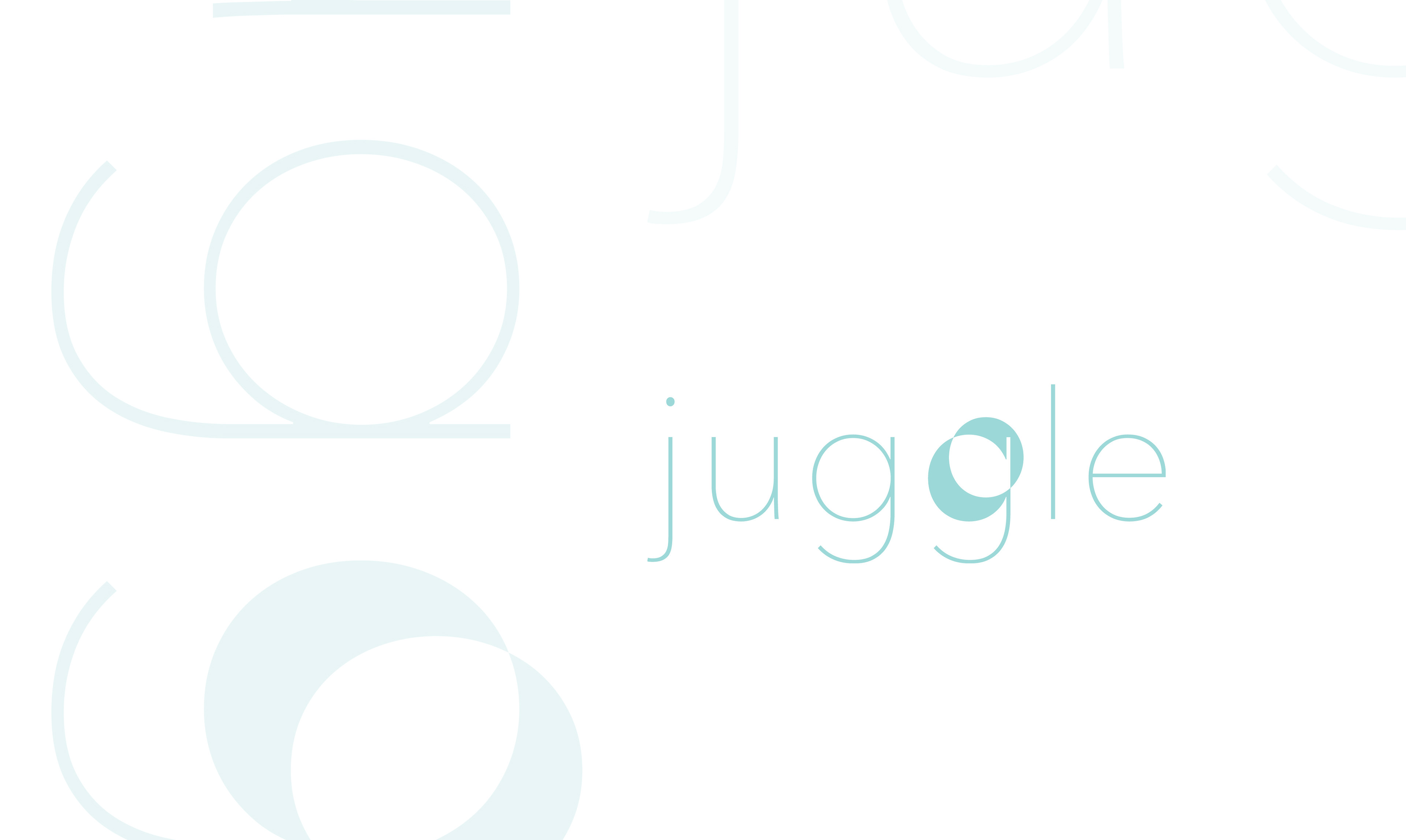
WORDMARK CONCEPT
The Juggle wordmark is lower case and the ultra light Avenir Next typeface to express the lightness, friendliness and delicateness of the the Juggle brand’s values. The counter from the second “g” floating away is a nod to the brand’s name, Juggle. It looks reminiscent of a bouncing ball and relates to children’s play and to the juggling act parents often perform.
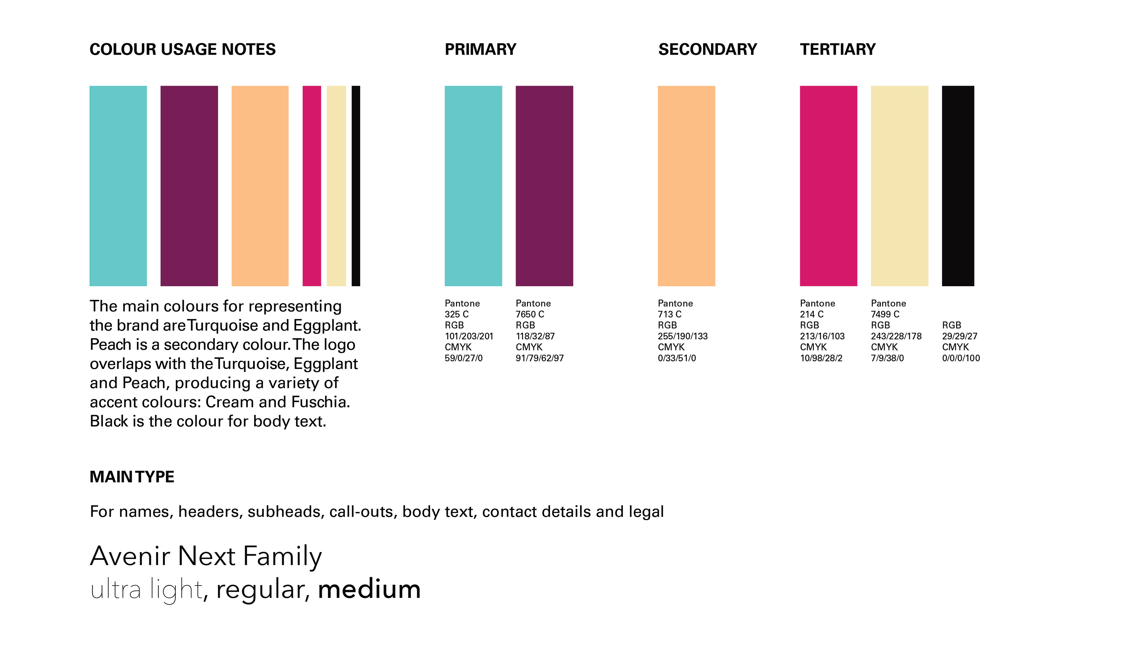
COLOR CONCEPT
Even though parenting is messy, the benefit that the Juggle brand is promising through its bottle warmer is a streamlined and clean experience with feeding, so the colour palette is fresh and the colors are bright and cheerful while also being inclusive.
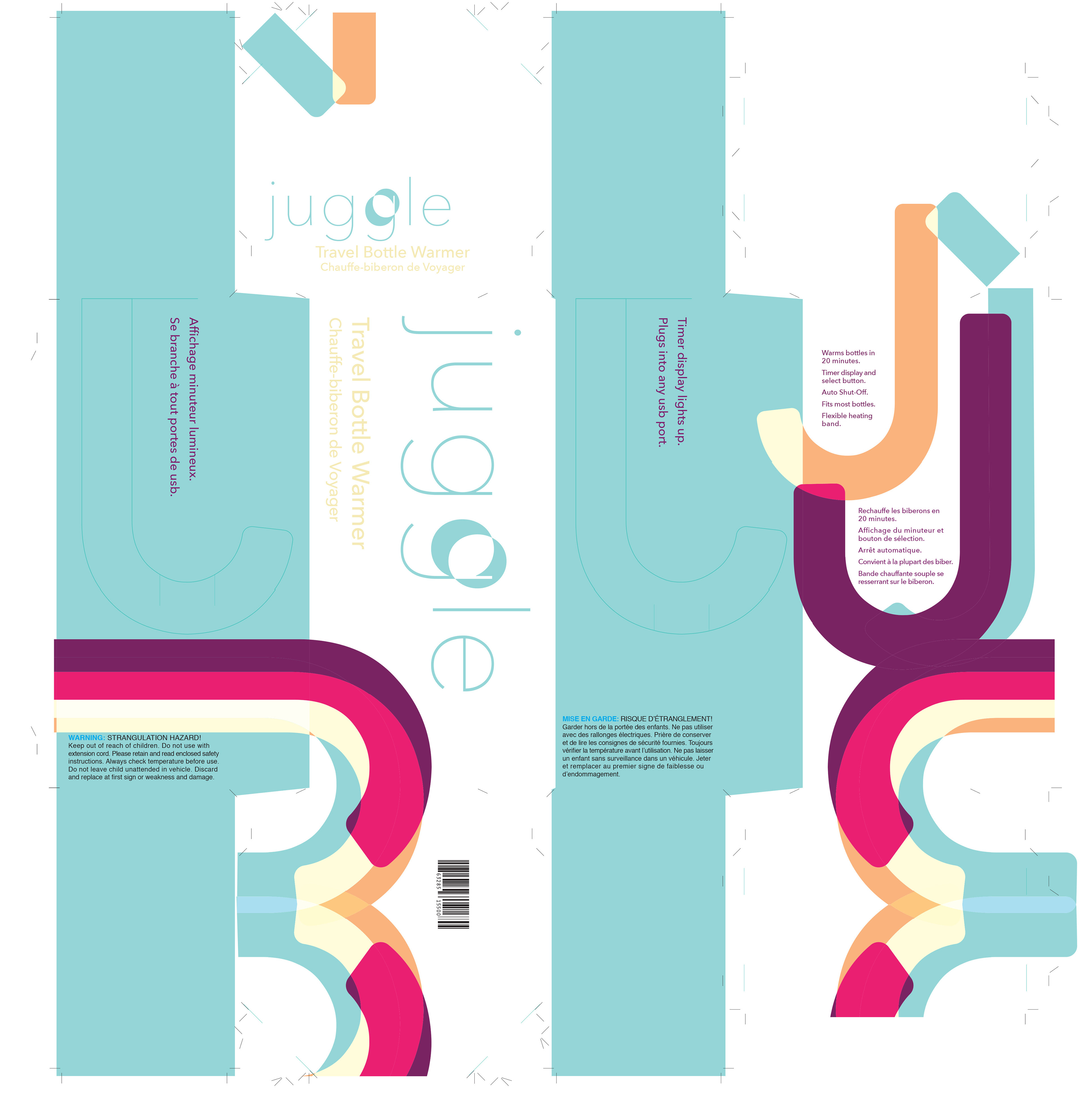
For packaging the Juggle bottle warmer, I designed a custom box based on a modified octagonal prism with “J” shapes cut out to form a carrier handle and also to reiterate the brand logo icon “J.”